What Is Information Architecture Explained
Learn what is information architecture and how it builds better digital experiences. This guide explains the core components and principles of IA.


Information architecture, or IA, is all about how you arrange the parts of something to make it understandable. Think of it as the invisible framework for your website or app. It’s the digital equivalent of a well-organized grocery store, where clear signs and a logical layout help you find the milk without wandering through the snack aisle for ten minutes.
Understanding The Blueprint Of Digital Content

At its heart, IA is the blueprint that dictates how a user moves through a digital space. It has very little to do with visual design or flashy graphics; it’s purely about clarity and logic. An information architect is a bit like a digital librarian, carefully cataloging every piece of content to make sure it has a sensible home and is easy for people to locate.
This structure is the absolute bedrock of a good user experience (UX). When IA is executed well, the technology simply gets out of the way. Users don’t even notice the complex system working behind the scenes—they just find what they need, mission accomplished.
The Rise Of A Critical Discipline
The demand for skilled information architects has skyrocketed. The broader UX profession, which encompasses IA, grew from just 1,000 people in the early 1980s to an estimated 1 million practitioners globally by 2017. That’s a thousand-fold increase, which tells you everything you need to know about how critical this work has become.
So, what does this "blueprinting" actually involve? It’s not just one thing, but a combination of several related systems working together.
To make this a bit more concrete, here's a quick breakdown of the core elements that make up any solid information architecture.
Core Elements of Information Architecture
| Element | What It Does | Real-World Analogy |
|---|---|---|
| Organization Systems | Groups related content and defines its structure. | The aisles in a grocery store (e.g., Dairy, Produce, Bakery). |
| Labeling Systems | Creates clear, consistent names for navigation and content. | The signs above each aisle that tell you what's in them. |
| Navigation Systems | Designs the pathways users take to move through content. | The main walkways that guide you from one section to another. |
| Search Systems | Enables users to find specific content directly. | Asking a store employee where to find a specific item. |
Each of these elements must work in harmony to create a seamless experience. If the labels are confusing or the organization is illogical, the whole structure starts to fall apart for the user.
Information architecture is about making the complex clear. It brings user-centered order to the often-messy world of information, ensuring everyone can access the right content at the right time.
IA is a non-negotiable part of early product development. To really see how it fits into the bigger picture, it helps to understand the systematic process detailed in this tactical guide to Product Discovery.
These same principles are also fundamental when choosing or building a content management system. After all, the IA dictates how information is stored, managed, and ultimately delivered to the user—a concept we explore further in our guide on https://www.contenttoolkit.co/blog/what-does-decoupled-mean.
The Four Pillars of Information Architecture

To build a solid digital structure, information architects lean on four core components. These aren't separate, siloed concepts; they're interlocking pillars that work together to turn a messy pile of content into something intuitive and easy to use. When they're all firing correctly, people find what they need without ever thinking about the complex system guiding them.
The Amazon homepage is a perfect example of these pillars in action. From the main navigation bar to the powerful search function and the clearly categorized products, everything is designed to help millions of people sort through a massive inventory without getting lost.
Organization Systems
The first pillar is organization. This is all about how you group and categorize your information. It’s the skeleton of your site, dictating where every piece of content lives and how it relates to everything else. Think of it as the digital equivalent of the Dewey Decimal System—a logical scheme that makes sure every book has a specific, findable home.
You can organize content in a few primary ways:
- Hierarchical: This is your classic top-down approach, like a family tree or a company org chart.
- Sequential: This works for step-by-step processes, like an online course module or a multi-page checkout flow.
- Matrix: This lets users approach the same content from multiple angles, like filtering a product page by price, brand, and color all at once.
Without a logical organization system, you’re just left with a digital junk drawer.
Labeling Systems
Next up is labeling. If organization is the shelf, labels are the signs on the aisles telling people what’s there. This pillar is all about choosing the right words to represent your content—the text on your menu items, buttons, and links.
Good labeling speaks your audience's language. It's the difference between a button that says "Contact Us" and one that uses an internal corporate term like "Stakeholder Inquiries." One is immediately clear, while the other forces users to guess, creating frustration and friction.
Navigation Systems
While labels act as signposts, navigation systems are the actual pathways people use to move around. This third pillar includes everything from the main menu that appears on every page (global navigation) to the menus within a specific section (local navigation) and the contextual links that connect related pieces of content.
A well-designed navigation system gives people a sense of control and orientation. They should always know where they are, where they've been, and where they can go next. This is absolutely critical when you're building out resources like a knowledge base CMS, where the entire point is to make information easy to find.
Search Systems
Finally, we have the search system, which is for the user who knows exactly what they want. It’s the digital equivalent of walking into a store and asking an employee for help. A good search function allows people to bypass the navigation entirely and query your content directly.
A great search function is more than just a box and a button. It includes features like filters, advanced search options, and "did you mean" suggestions to help users refine their queries and find information even when they aren't sure of the exact terminology.
A Look Back: Where Information Architecture Came From
To really get a handle on what information architecture is today, it helps to see where it came from. This isn't some brand-new concept that popped up with the internet. Its DNA can be traced back to much older fields, especially library science and cognitive psychology.
Think about it: for centuries, librarians have been perfecting systems to classify, catalog, and help people find massive amounts of information. That's the conceptual foundation of IA, just applied to a different medium.
At the same time, cognitive psychology gives us the "why" behind it all. It digs into how our brains process information and make sense of the world. Good IA uses these insights to make navigating a website or app feel intuitive, reducing the mental effort required from the user. This history proves IA isn't just a tech trend; it's a modern spin on timeless, human-centered organization.
The Digital Explosion
The actual term "information architecture" was coined back in the 1970s by an architect and graphic designer named Richard Saul Wurman. He saw it as the art and science of organizing and labeling things to make them easy to find and use. But the field really took off with the internet boom of the 1990s.
Suddenly, websites went from simple, single pages to sprawling, complex digital mazes. This created a new kind of problem: digital chaos. There was a desperate need for people who could bring order to this mess, and the principles Wurman laid out became incredibly relevant. A new generation of practitioners emerged, tasked with taming the web's wild frontier.
A turning point came in 1998 with the publication of 'Information Architecture for the World Wide Web' by Louis Rosenfeld and Peter Morville. This book essentially cemented IA as a distinct and crucial discipline for the digital age.
The practice has grown up a lot over the last 30 years, evolving from basic information design in the 1960s to the well-defined field we have today.
This structured approach is more important than ever. For example, a solid IA is the backbone of any good cloud-based content management system, dictating how every piece of content is stored, connected, and delivered. When you understand the history, you see that IA isn't just about building websites—it's about making information make sense, no matter where it lives.
Putting the Eight Principles of IA to Work
Knowing the history and theory of information architecture is one thing, but the real test comes when you start applying that knowledge. Veteran information architect Dan Brown gave us a huge leg up by outlining eight core principles that serve as a practical guide for building digital structures people can actually use.
These aren't stuffy, academic rules. Think of them as a field guide for making smart design choices that lead to genuine clarity. They give teams a common vocabulary and a way to measure whether a site's structure is actually helping or hurting its users.
The Guiding Rules for Clarity
The first few principles are all about managing what users see and how they process it. It's really about respecting their mental energy.
The Principle of Choices: Less is almost always more. When you present someone with a wall of options, they often freeze up—a classic case of decision paralysis. Good IA limits choices to a small, meaningful set, guiding users forward instead of leaving them stranded.
The Principle of Disclosure: Don't show all your cards at once. You should reveal information gradually, giving people just enough of a scent to know what they’ll find if they take the next step. This creates a natural sense of discovery without overwhelming the screen.
The Principle of Exemplars: Show, don't just tell. When you create a category, use examples to make it tangible. A navigation link that just says "Smart Home" is abstract, but showing a few images of a smart thermostat, a video doorbell, and smart lighting right there in the menu makes its meaning instantly clear.
This next diagram really drives home how IA's roots in library science and psychology blossomed into a critical discipline with the rise of the web.
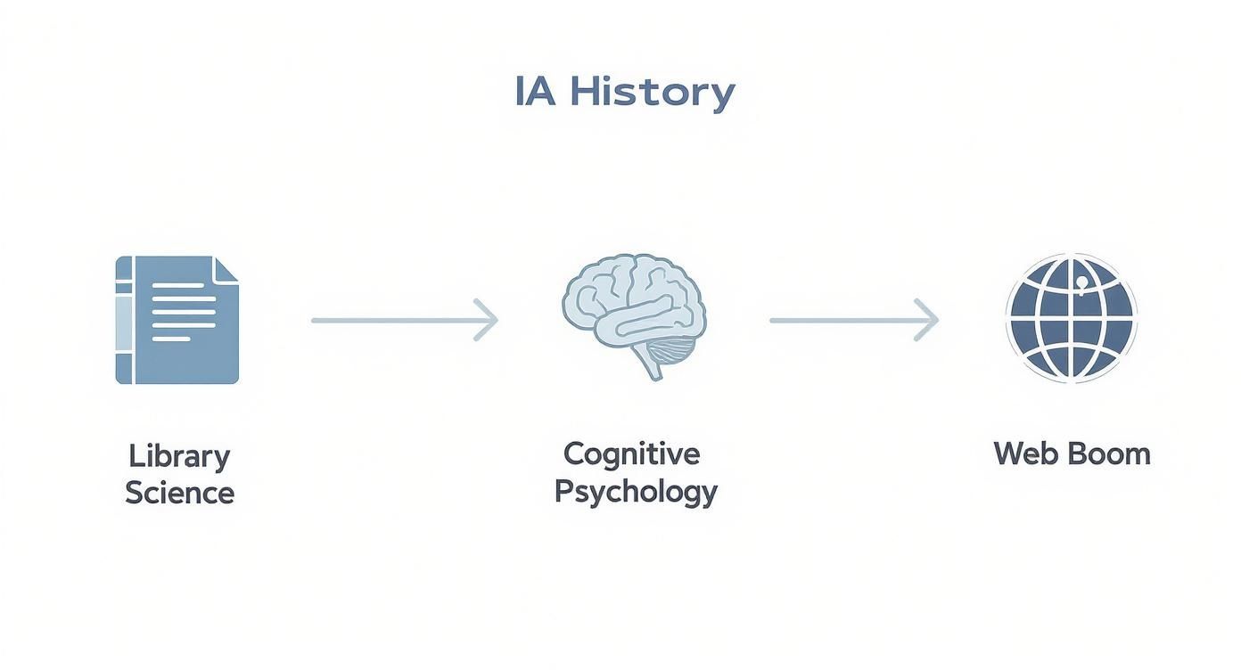
As you can see, IA isn't some brand-new concept. It's the modern evolution of timeless organizational strategies, retooled for the digital age.
Building for Reality and the Future
The next set of principles forces us to admit two hard truths: users don't behave how we expect, and our work is never truly done. These are about building systems that are flexible and resilient.
The Principle of Front Doors: You have to assume at least 50% of users will land on a page other than your homepage. Every single page needs to serve as a potential front door, giving people enough context to figure out where they are and what they can do next, no matter how they got there.
A product page someone finds through a Google search needs to be just as orienting as the homepage. This idea is especially important when you consider how different platforms interact. For example, the relationship between a CMS and CRM depends on understanding and managing user journeys from all these different entry points.
Finally, there are the principles that ensure what you build today won't fall apart tomorrow:
The Principle of Multiple Classification: People think differently, so let them browse differently. One person might search for a camera by brand, while another looks by sensor size, and a third by price range. A solid IA provides all these pathways to the same destination.
The Principle of Focused Navigation: Don't turn your navigation menu into a junk drawer. A menu should have a clear, consistent purpose. If it’s for navigating your company's services, don't suddenly throw in links to your blog, job openings, and the company picnic photo gallery. Keep it focused.
The Principle of Growth: Whatever you build, assume it will get bigger. Your content library will expand, new product lines will be added, and services will evolve. The architecture has to be designed from day one to accommodate that growth without becoming a chaotic mess.
Seeing IA Principles in the Wild
It's one thing to read about these principles, but it's another to see how they play out on real websites. The difference between a site that applies them well and one that doesn't is something you can feel immediately as a user. Here’s a quick comparison.
| IA Principle | Effective Example (e.g., Wikipedia) | Ineffective Example (e.g., outdated university site) |
|---|---|---|
| Choices | Article pages offer a focused set of choices: Contents, Edit, View history. They don't overwhelm with every possible action. | The homepage presents dozens of links for "Students," "Faculty," "Alumni," and "News" in one massive, undifferentiated block. |
| Disclosure | The table of contents shows only top-level headings. You click to expand sections, revealing more detail progressively. | A program page lists every single course requirement, faculty member bio, and administrative form on one endless scrolling page. |
| Multiple Classification | You can find the page on "Albert Einstein" by searching his name, browsing "Physicists," or following a link from "Theory of Relativity." | Academic departments are listed only alphabetically, with no way to filter by school (e.g., Arts & Sciences) or by degree type. |
| Front Doors | Landing on any Wikipedia article from a search engine, you immediately see the title, a quick summary, and clear navigation back to the main site. | Arriving on a specific course description page from Google leaves you stranded with no clear "home" button or site-wide navigation. |
This comparison highlights a crucial point: good IA isn't an accident. It's the result of intentionally applying these principles to guide users, reduce frustration, and ultimately help them achieve their goals.
Why Good IA Is Good for Business

Strong information architecture is much more than a "nice-to-have" feature; it’s a core asset that directly contributes to your bottom line. When people can find what they’re looking for intuitively, they stay longer, dig deeper into your site, and are far more likely to see your brand as trustworthy. All of this translates directly into tangible business results.
Put yourself in your customer's shoes for a moment. A confusing website is a frustrating one. If a potential buyer can't track down pricing or product specs in a few seconds, they're gone. That's how high bounce rates kill sales before they even have a chance.
Driving Conversions and Building Trust
A logical, predictable structure doesn't just cut down on user frustration—it actively builds your credibility. When a digital experience feels seamless and professional, people assume the company behind it is, too. This trust is the bedrock of every conversion, whether that’s making a sale, capturing a lead, or getting a newsletter signup.
Poor IA creates friction, and friction is the enemy of conversion. By organizing content around how your users actually think and search, you create a smooth, clear path to your most important business goals. The impact shows up in your key metrics:
- Lower Bounce Rates: Visitors find what they came for and have a reason to stick around.
- Longer Session Durations: An intuitive layout encourages exploration and deeper engagement.
- Higher Conversion Rates: A clear path to action removes roadblocks, making it easier for people to buy or inquire.
A well-planned IA turns a user's journey from a frustrating scavenger hunt into a guided tour. This clarity is what converts casual visitors into confident customers.
Creating a Scalable and Cost-Effective Foundation
Looking beyond the immediate user benefits, a solid IA framework delivers serious long-term value. It makes your entire digital presence more manageable and scalable. When your content is logically structured from day one, adding new products, services, or blog posts doesn't threaten to bring the whole system crashing down. This foresight simplifies content management and drastically cuts future development costs.
In fact, the principles behind AI for knowledge management—so critical for modern businesses trying to organize internal information—rely heavily on these very same architectural ideas.
Ultimately, investing in IA is about future-proofing your digital strategy. This is especially true when you compare CMS systems, as the platform you choose must be able to support an evolving information structure. By building a coherent framework today, you create a resilient foundation that will support your business goals for years to come.
Common Questions About Information Architecture
As information architecture becomes more central to digital projects, a lot of questions pop up about what it is, what it isn't, and where it fits in. Let's clear up some of the most common points of confusion to get a better handle on its real-world value.
This isn't just about defining a term; it's about understanding how to apply it effectively.
What Is the Difference Between IA and UX Design?
It's easy to see why people often lump information architecture and user experience (UX) design together, but they are two distinct, though deeply connected, disciplines.
Here’s a simple way to think about it: IA is the blueprint for a house, while UX is the feeling of actually living in it.
Information architecture has a very specific focus: organizing, structuring, and labeling content so people can find what they're looking for. It’s the logical skeleton holding everything together. UX design is the bigger picture. It encompasses every single interaction a user has with a product—from the visual appeal and button placement to the loading speed and the emotional response it triggers.
Good IA is a non-negotiable foundation for good UX. You cannot build a positive user experience on top of a confusing, chaotic information structure. One directly enables the other.
A UX designer thinks about the entire journey, but the information architect is the specialist who draws the map that makes a smooth journey possible in the first place.
Is Information Architecture Only for Websites?
Not at all. While the web is where IA really came into its own, its principles are universal. They apply to any system, digital or physical, where people need to find their way through a complex set of information.
Think about it—any environment that needs clear organization to be functional relies on some form of information architecture.
This includes a huge range of applications:
- Mobile Apps: Figuring out how to logically arrange features and content on a tiny screen.
- Software Interfaces: Designing intuitive menus, settings, and dashboards.
- Company Intranets: Making sure employees can quickly find company policies, project documents, or internal tools.
- Physical Spaces: The layout and signage in a museum, the flow of an airport, or the wayfinding system in a hospital.
Basically, if a system presents information to a human, IA is what makes that interaction work.
Who Is Responsible for Information Architecture?
This really depends on the size and maturity of the team. In a large organization, you might find a dedicated Information Architect or a Content Strategist whose entire job is to own this. They live and breathe content structures and navigation systems.
In smaller companies or startups, however, the responsibility is often a shared hat. It might be a UX designer who tackles the IA, or it could fall to a product manager or even a developer.
The job title isn't what's important here. What truly matters is that someone is intentionally and thoughtfully planning the architecture. Without that deliberate effort, the structure tends to grow organically into a disorganized mess, which is a one-way ticket to a frustrating user experience.