How to Build Portfolio Website: Tips to Stand Out
Learn how to build a portfolio website with our practical guide. Discover tips to choose the right platform, design effectively, and launch successfully.


Before you even think about picking a template or writing a single line of code, the most important work happens away from the screen. Building a portfolio that actually gets you work starts with a simple, foundational question: Why are you building this, and who is it for?
This initial strategic thinking is what separates a generic, forgettable gallery from a powerful career-building tool. Every single decision you make down the line—from the projects you feature to the color of your buttons—hinges on the answers to these two questions.
Defining Your Portfolio's Purpose and Audience
Look, a portfolio isn't just a digital folder of your greatest hits. It’s a precision instrument designed to achieve a very specific outcome. Without a clear goal, you're just throwing stuff at a wall and hoping something sticks. You need to get laser-focused on its exact function.
Are you a freelance photographer trying to book more weddings in the $5,000 - $10,000 price range? Or are you a UX designer aiming for a senior role at a fast-growing SaaS company? The way you present your work to a bride-to-be is entirely different from how you'd pitch your skills to a VP of Product.
First, Nail Down Your Audience
Everything—and I mean everything—is dictated by your audience. The tone you use, the projects you highlight, the way you frame your case studies... it all comes back to the person on the other side of the screen.
So, who are you trying to convince? Is it a creative director who's short on time and high on standards? A startup founder who only cares about ROI? A recruiter who scans dozens of portfolios a day?
Get specific. Sketch out a quick persona of this ideal visitor. What keeps them up at night? What problems are they desperately trying to solve? When you understand their world, you can position your portfolio not as a static resume, but as the perfect solution to their problem.
Key Takeaway: Your portfolio isn't for you—it’s for them. Every single element should be put through one filter: "Will this convince my target audience that I'm the right person for the job?"
Next, Sharpen Your Core Message
Once you know who you’re talking to, you have to figure out what you’re going to say. When they click away from your site, what’s the one single thing you want them to remember about you? That’s your core message.
This is your unique value proposition, boiled down to its essence. It’s not just, “I’m a copywriter.” It’s, “I write conversion-focused email sequences for B2B tech companies that turn free trial users into paying customers.” See the difference? A strong message creates a narrative that ties your entire portfolio together.
The Art of Ruthless Curation
Here’s where so many people go wrong. They treat their portfolio like an archive, dumping every project they’ve ever touched into one overwhelming pile. This is a huge mistake. The goal here is quality over quantity, always.
You need to practice strategic curation. Your portfolio should be a reflection of the work you want to be hired for, not just a historical record of what you've done.
To get this right, run every potential project through this simple framework:
- Is it relevant? Does this project scream "I can solve your specific problem" to my target audience?
- Is it high-quality? Does this represent the absolute best I can do?
- Does it show results? Can I prove that my work led to a tangible, positive outcome?
If you’re just starting out, don’t be afraid to create spec work (self-initiated projects) to fill the gaps and build a portfolio that’s perfectly aligned with your goals. For seasoned pros, it’s about being ruthless and cutting anything that doesn’t fit your core message.
These principles hold true whether you’re using a simple drag-and-drop tool or a more advanced CMS. If you're still deciding on a platform, our guide on choosing a website builder for small business has some great insights that are just as relevant for portfolios. Getting this groundwork right is what transforms your website from a passive gallery into an active, persuasive engine for your career.
Choosing the Right Platform for Your Portfolio
The first real decision you’ll make—and honestly, the most important one—is where to actually build your portfolio. This isn't just a technical choice; it's the foundation for your entire online presence. It dictates everything from your design flexibility and long-term costs to how much time you’ll spend wrestling with updates.
Think of it this way: a freelance photographer needs a platform that makes images pop, with gorgeous galleries and almost no technical fuss. A UX designer, on the other hand, needs to build out detailed case studies, which requires far more control over custom layouts and interactive elements. If you don't match the tool to your trade, you'll feel boxed in pretty quickly.
Before you even look at a single platform, it’s a smart move to sketch out what you actually need your site to do.
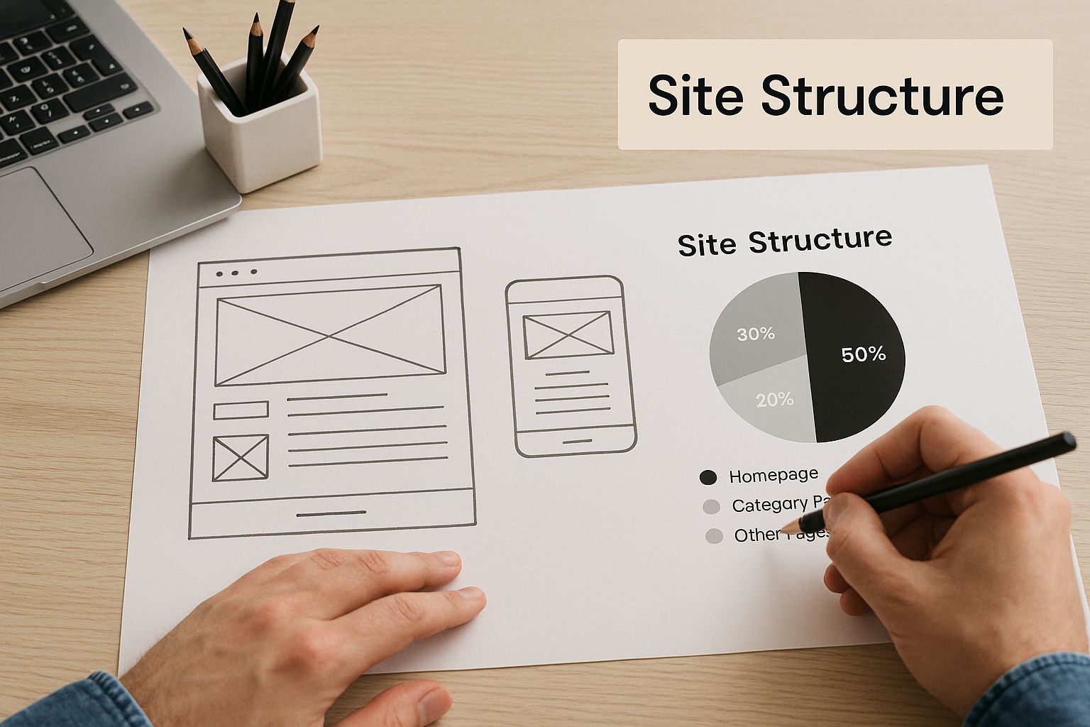
Mapping out your pages and how they connect—like in the image above—forces you to clarify your vision. Once you know what you're building, picking the right tools becomes much easier.
Website Builders vs. Self-Hosted Solutions
Your options really boil down to two main camps: all-in-one website builders or a self-hosted Content Management System (CMS). They serve very different needs.
Website builders like Squarespace, Wix, and Webflow are designed for simplicity. They bundle your hosting, security, design tools, and support into one neat subscription. This is perfect if you just want to get your site live without getting your hands dirty with server settings or code.
On the flip side, a self-hosted platform like WordPress.org gives you total freedom. You pick your own hosting, and you can customize literally anything with an endless supply of themes and plugins. It’s powerful, but that power comes with a steeper learning curve and the responsibility of handling your own site maintenance and security.
A common mistake I see is people only looking at the monthly sticker price. With a self-hosted site, you have to account for the cost of premium plugins, themes, and maybe even a developer's help down the line. That "cheaper" option can sometimes end up costing more than an all-in-one builder.
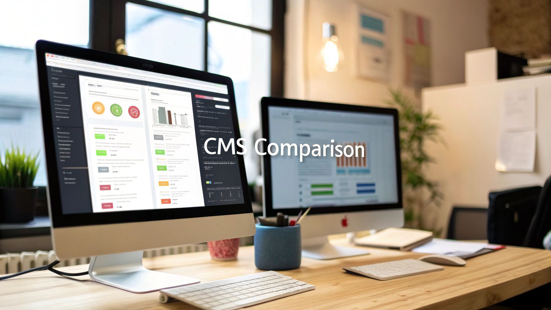
A Practical Comparison of Top Platforms
To help you see the trade-offs in action, I've put together a quick comparison of the most popular platforms I see professionals using for their portfolios.
Comparing Popular Portfolio Platforms
This table breaks down the key players based on what matters most for a portfolio: how easy they are to use, how much they cost, and how much you can truly make them your own.
| Platform | Best For | Ease of Use | Customization | Typical Monthly Cost |
|---|---|---|---|---|
| Squarespace | Photographers, Artists, Designers | Very High | Medium | $16 - $27 |
| Webflow | UX/UI Designers, Developers | Medium | Very High | $14 - $39 |
| WordPress.org | Bloggers, Content Creators | Low to Medium | Unlimited | $10 - $50+ (Hosting & Add-ons) |
| Adobe Portfolio | Creative Cloud Subscribers | Very High | Low | Included with Adobe CC |
As you can see, there's a clear give-and-take. If you want a beautiful, professional-looking site up and running this weekend, Squarespace is a fantastic choice. If you need pixel-perfect control to showcase intricate design work, Webflow has become the go-to for a reason. And for those who want to own every line of code and have limitless potential to scale, WordPress.org is still the king.
Many of these platforms have evolved to include features specifically for job-seekers. When doing your research, checking out reviews of the best free resume website builder tools can give you some great ideas for what to look for.
Securing Your Domain and Hosting
No matter which platform you choose, you’ll need a professional domain name. This is your digital address—your brand. It needs to be right.
- Keep it professional. No nicknames or clever-but-confusing spellings.
YourName.comis almost always the best bet. - Keep it short. The easier it is to type, the better.
- Stick with
.comif you can. It's the standard for a reason. That said, extensions like.meor.designcan work well for creative fields.
If you go with a website builder, hosting is part of the package. Simple. For a self-hosted WordPress site, you'll need to buy hosting separately. Prioritize providers known for speed (slow-loading portfolios are a deal-breaker) and great customer support.
The market for these tools is exploding for a reason. Valued at around USD 2.3 billion in 2023, the global website builder market is projected to skyrocket to USD 6.5 billion by 2032. This isn't just a trend; it's a reflection of how critical a unique online presence has become for professionals.
At the end of the day, the right platform is the one that gets out of your way and lets you focus on showcasing your amazing work. If you want to dig even deeper into the pros and cons, our detailed website builder reviews can help you lock in your final decision.
Designing an Unforgettable User Experience
A great portfolio is more than just a gallery of your work—it’s an experience. It’s the story you tell a potential client or employer before you even speak a word. The design and user experience (UX) are what elevate a simple collection of projects into a powerful argument for why someone should hire you.
The goal is simple: make your work the hero. Every decision, from the font you choose to how fast your page loads, should serve that purpose. A cluttered or slow website can completely undermine even the most brilliant projects. Getting the UX right isn't just a nice-to-have; it's everything.
This focus on user-centric design is exactly what’s driving massive growth in the web development world. The global market was valued at USD 65.35 billion in 2023 and is on track to hit USD 130.9 billion by 2032. That explosion is all about the demand for clean, modern, and intuitive digital experiences. You can dive deeper into this expanding market and its trends on vrinsofts.com. A well-designed portfolio is your ticket to standing out in this crowded field.
Crafting an Intuitive Layout and Navigation
Your site’s structure should feel so natural that no one even thinks about it. A visitor should never have to hunt for what they need or wonder where to click next. The best portfolio layouts are clean, logical, and put your projects front and center.
Think of it as guiding your visitor down a clear path. A proven structure usually looks something like this:
- Homepage: The first impression. It needs a strong, clear statement about who you are and what you do, with an immediate call to view your work.
- Work/Portfolio: The main event. This is typically a grid or list of your best projects, showcased with compelling thumbnails and straightforward titles.
- Project/Case Study: The deep dive. Here, you walk through individual projects, explaining the problem, your process, and the outcome.
- About Page: Your professional story. This is where you share your skills, background, and a bit of your personality.
- Contact Page: The final step. Make it incredibly simple for people to get in touch.
Your navigation menu should mirror this simplicity. Stick to clear, universally understood labels. "Work" or "Projects" will always beat something clever like "Creations."
Choosing Your Visual Brand Identity
Your typography and color palette aren’t just decoration; they’re extensions of your professional brand. A minimalist designer might stick to a monochrome scheme with a crisp sans-serif font. A brand strategist, on the other hand, might use bolder colors and more expressive type to convey a different energy.
Whatever you choose, consistency is what ties it all together.
- Typography: Keep it simple. Pick two, maybe three, complementary fonts. You’ll want one for headings and one for body text. Above all, make sure your body font is easy to read.
- Color Palette: Limit yourself to a palette of two to four colors. Use a primary color strategically for important elements like links and buttons to guide the user's eye.
- White Space: Don't be afraid to leave some room. White space is your best friend—it reduces clutter, improves readability, and lets your actual work shine.
For anyone in a design-focused role, presenting your work is a skill in itself. If you need some solid advice on project selection and presentation, there's an excellent guide on creating a compelling UI/UX designer portfolio that goes into more detail.
Pro Tip: Your portfolio's design should complement your work, not compete with it. If you find your flashy background animations are getting more attention than your project images, it's time to scale it back.
Ensuring Flawless Responsiveness and Performance
Let’s be real: more than half of all web traffic now comes from mobile devices. If your portfolio looks broken or is a pain to use on a phone, you’re losing out on opportunities. It's as simple as that. While most modern website builders provide responsive templates out of the box, you absolutely must test your site on actual phones and tablets.
Performance is just as critical. Nothing kills interest faster than a slow-loading website. Before you upload a single image or video, optimize it. Use tools to compress your files without destroying their quality. Every millisecond counts. A snappy, fast-loading site shows that you’re a professional who respects your visitor’s time.
If performance is a top priority for you, it’s worth exploring some of the best static site CMS options, as they are inherently built to be lightweight and incredibly fast.
Turning Projects Into Compelling Case Studies
Your work is excellent, but a simple gallery of images won't cut it. The real magic of a powerful portfolio happens when you wrap each project in a compelling story. This is where you elevate static screenshots and links into case studies that showcase your thinking, your process, and the real-world impact you deliver.
This is all about crafting the content that transforms your portfolio from a visual catalog into a persuasive career tool. It starts with a strong "About Me" page and carries through to how you structure each project narrative to resonate with potential clients and employers.
Crafting Your Professional Narrative
Before anyone dives into your work, they want to know who you are. The "About Me" page is often the second-most-visited spot on a portfolio, yet so many people treat it like a throwaway. That’s a huge missed opportunity.
The goal here isn't just to list your skills or job titles. It's about making a genuine connection.
- Lead with your "why." What problems do you genuinely love to solve? Kicking things off with your motivation is far more engaging than just stating what you do.
- Show, don't just tell. Instead of calling yourself a "creative problem-solver," share a quick story about a time you untangled a particularly tricky problem.
- Connect your past to your present. Briefly explain how your background—even if it seems completely unrelated—has shaped your skills and the way you approach your work today.
This page is your chance to build a little trust and let your personality shine through. It sets the stage for the proof you're about to show off in your case studies.
The Anatomy of a Powerful Case Study
Think of a case study as more than a project description; it’s a story with a clear beginning, middle, and end. It walks a visitor through your entire process, showing them not just what you did, but why you did it and what happened as a result. A well-structured case study is proof you can deliver real value.
For every project you decide to feature, try to follow this simple but incredibly effective framework.
- The Problem or Challenge: Always start with the client's pain point. What issue were they facing? Was it dwindling user engagement, a stale brand identity, or clunky internal processes? When you frame the problem from their perspective, it immediately becomes more relatable.
- Your Specific Role and Process: Clearly outline your contribution. Were you the lead designer, part of the development team, or the sole copywriter? Then, walk through your process. This is where you get to reveal your strategic thinking. Did you run user research sessions? Did you build out wireframes? A/B test a dozen headlines?
- The Solution and Final Outcome: This is the big reveal. Show off the final product with high-quality images, videos, or even links to a live version. But most importantly, tie your work directly back to the initial problem. Did you increase conversions by 15%? Did your redesign lead to a 30% drop in bounce rate?
Key Insight: Metrics are your most persuasive tool. Even if you don't have hard data, you can use qualitative feedback. A client testimonial about how your work simplified their workflow can be just as powerful as a percentage.
Presenting Your Work Effectively
How you organize and present your case studies is just as important as the content itself. You have to strike a balance—provide enough detail to be convincing without overwhelming busy visitors with a wall of text.
Breaking down your process into digestible chunks is the way to go.

For instance, a UX designer might structure their case study with clear subheadings like "User Research," "Wireframing & Prototyping," and "Final UI Design." A copywriter could use sections like "Brand Voice Analysis," "Headline Exploration," and "Long-Form Sales Page." This methodical approach shows you’re a professional and makes your thinking easy for anyone to follow.
Juggling all this content, from research notes to final metrics, can get messy fast. Staying organized is crucial. There are some great tools out there for structuring your thoughts, like the versatile workspace offered by Notion, which is great for content management. Using a structured tool helps you make sure every case study is complete and compelling before you even touch the web builder. When you present your work as a strategic solution, you position yourself not just as a creator, but as a valuable partner.
Finalizing and Launching Your Portfolio Website

You're in the home stretch. The designs are done, the case studies are written, and your portfolio is looking sharp. But don't hit the launch button just yet. This final phase is all about the details—the small but crucial checks that separate a professional debut from a sloppy one.
Getting this last part right ensures your hard work makes the best possible first impression. It’s the difference between a seamless launch and one that’s riddled with broken links and typos.
Mastering Your On-Page SEO Fundamentals
Before a potential client can hire you, they have to find you. This is where a little on-page Search Engine Optimization (SEO) comes into play. You don't need to be an SEO guru, but covering the absolute basics is non-negotiable if you want to attract organic traffic from search engines like Google.
Think of these elements as digital signposts guiding search engines to your work.
- Title Tags: This is the clickable headline in a search result. Each page needs a unique, descriptive title. For a project page, something like "Brand Identity Redesign for Client X | Your Name" works great.
- Meta Descriptions: This is the short summary that appears under the title in search results. While it doesn't directly influence rankings, a well-written one is your sales pitch—it convinces people to click. Briefly explain what the page is about.
- Image Alt Text: This is a simple description for each image. It not only tells search engines what your visuals depict but, more importantly, makes your site accessible to users with visual impairments who use screen readers.
These small tweaks add up, signaling to Google that your site is a high-quality resource worth showing to people.
Implementing Essential Analytics Tools
Launching a website without analytics is like flying blind. You have no idea who is visiting, where they're coming from, or what they're doing on your site. Setting up analytics before you launch is essential for capturing clean, accurate data from day one.
The industry standard is Google Analytics, and it’s completely free. Installing it lets you track critical metrics:
- Audience Demographics: See where your visitors are located.
- Traffic Sources: Find out if people are discovering you through Google, LinkedIn, or other websites.
- User Behavior: See which case studies get the most attention and where people might be leaving your site.
Key Takeaway: Analytics data is direct feedback from your audience. If you see that your "About" page has a high bounce rate, that’s a clear signal that the content isn't connecting and might need a rewrite.
For those focused on raw performance, especially developers, a static site generator might be the way to go. If you're interested in that path, we have resources on using Hugo for your projects, which is famous for its blazing-fast speed.
The Ultimate Pre-Launch Checklist
Before you announce your new site to the world, run through one last, meticulous check. This final pass is your best defense against embarrassing and unprofessional mistakes.
Here’s a simple but powerful checklist I run through on every project:
- Proofread Everything: Read every single word on your site out loud. It feels a bit silly, but it's the single best way to catch typos and clunky sentences that your eyes will otherwise skim right over.
- Test Every Link: Click every single link. That means your main navigation, social media icons, and any links within your case studies. A 404 error is a dead end for a potential client.
- Submit Your Contact Form: Fill out and submit your own contact form. Then, go check your inbox. You have to be 100% sure the message came through. You can't afford to miss an inquiry because of a simple technical glitch.
- Check Mobile Responsiveness: Pull out your phone and a tablet. Test everything. Does the text wrap correctly? Are buttons easy to tap? Do your images look good?
Once you've ticked every box, you're ready. Share your portfolio link on LinkedIn and other professional networks. A simple announcement post will start driving that first wave of traffic and, hopefully, your next big opportunity.
Answering Your Top Portfolio Questions
Once you get to the final stages of building your portfolio, a few common questions always seem to pop up. You’ve done the heavy lifting—figuring out your goals and gathering your best work—but these last few details can really make or break how people see your portfolio. Let's clear them up so you can launch with confidence.
Most of these questions circle back to the same themes: how many projects to show, whether you need to code, and what pages are absolutely non-negotiable. Getting these right will make your site not just complete, but truly effective.
How Many Projects Should I Really Show?
This is the big one. And the answer is always, always quality over quantity. I see so many people fall into the trap of thinking more is better, but a crowded gallery of so-so projects just dilutes the impact of your best work.
A good rule of thumb is to showcase 5 to 10 of your absolute strongest projects. Think of your portfolio as a highlight reel, not a dusty archive. Each piece you include should have a clear purpose and point directly to the kind of work you want to be doing next.
A great portfolio isn't an archive; it's a highlight reel. It's more powerful to present five projects with in-depth case studies that tell a complete story than to list twenty projects with minimal context. This approach shows you can deliver results, not just complete tasks.
Remember, you're steering your career here. If you're a graphic designer trying to pivot into UX, feature those projects that show user research and problem-solving, even if they aren't your most visually stunning pieces. That kind of strategic thinking is what makes a portfolio work for you.
Do I Need to Know How to Code to Build This Thing?
For most creatives, the answer is a resounding no. You definitely don’t need to be a developer. Thanks to a whole ecosystem of powerful and user-friendly website builders, anyone can create a professional-looking site without touching a line of code.
Platforms like Squarespace, Wix, and Webflow were practically built for this. They offer intuitive drag-and-drop tools and beautiful templates that let you get a high-end result without the technical headache.
But there’s one major exception to this rule:
- If you're a web developer, then yes, you should build your site from scratch. Your portfolio is a project. It’s a real-world demonstration of your skills, from clean HTML and CSS to responsive design and JavaScript.
For everyone else—photographers, writers, designers, you name it—a no-code builder is the smartest, most efficient way to get online. Spend your time crafting compelling case studies, not fighting with CSS.
What Are the Must-Have Pages for My Portfolio?
You can always expand your site later, but every portfolio needs to start with a solid foundation. These core pages create a clear journey for your visitors, guiding them from a first impression to getting in touch.
At a minimum, your site needs these three pages:
- Homepage: Think of this as your digital handshake. It needs to immediately say who you are, what you do, and give visitors a clear next step (usually, to view your work).
- Work/Portfolio Page: This is the main event. It’s where you’ll feature your curated projects, with great visuals and links to dig deeper into the case studies.
- About Page: This is where you tell your story. Go beyond a dry bio and share your background, your process, and what makes you tick. It’s your chance to connect on a human level.
And of course, a dedicated Contact page is essential. Don't make people hunt for your email address. A simple form and links to your professional social profiles make it incredibly easy for potential clients or employers to take the next step.