How to Optimize Website Performance: Top Tips to Boost Speed
Learn how to optimize website performance with proven strategies to improve speed, UX, and Core Web Vitals. Boost your site now!


Optimizing your website isn't just about one thing. It's a combination of smart strategies—like compressing images, minifying code, and using a Content Delivery Network (CDN)—all working together to slash load times. Getting this right means your site is not just fast and responsive, but also ready to meet the high expectations of today's users and search engines.
Why Website Performance Is Your Greatest Advantage

Let's be blunt: a slow website actively hurts your business. In a world where we expect everything instantly, every millisecond matters. A sluggish site is a surefire way to lose revenue, erode user trust, and get buried in search results. Performance has moved from a technical afterthought to a cornerstone of any solid digital strategy.
The data backs this up. The link between speed and success is crystal clear. Think about this: a staggering 53% of mobile users will leave a website if it takes longer than three seconds to load. That single statistic from Google highlights just how high the stakes are, especially on mobile. If you want to dive deeper, you can explore more on the latest web performance optimization trends from this insightful article.
Understanding Core Web Vitals
To bring some order to the chaos of performance metrics, Google introduced its Core Web Vitals. These aren't just friendly suggestions; they are direct ranking factors that have a real impact on your site's visibility. Getting a handle on them is your first real step toward a faster site.
Largest Contentful Paint (LCP): This measures how long it takes for the main event—the largest image or text block—to appear on the screen. The magic number here is under 2.5 seconds. LCP is all about that initial "Aha, the page is loaded" feeling for the user.
Interaction to Next Paint (INP): This one is about responsiveness. When someone clicks a button or taps on your site, how quickly does something happen? A good INP score is under 200 milliseconds, which feels snappy and lag-free.
Cumulative Layout Shift (CLS): We've all been there—you go to click something, and suddenly an ad loads and pushes the whole page down, causing a misclick. CLS measures this visual instability. You want a low score, ideally under 0.1, to ensure a smooth, predictable experience.
Google provides clear benchmarks for these metrics, which help you understand where your site stands. Think of them as a report card for your site's user experience.
Core Web Vitals Performance Thresholds
| Metric | Good | Needs Improvement | Poor |
|---|---|---|---|
| LCP | ≤ 2.5 seconds | > 2.5s and ≤ 4.0s | > 4.0 seconds |
| INP | ≤ 200 milliseconds | > 200ms and ≤ 500ms | > 500 milliseconds |
| CLS | ≤ 0.1 | > 0.1 and ≤ 0.25 | > 0.25 |
Hitting the 'Good' threshold for all three is the goal, as it signals to both users and search engines that your site delivers a high-quality experience.
Performance is the ultimate user experience feature. A fast, stable, and responsive website communicates respect for the user's time and builds a foundation of trust that encourages them to engage, convert, and return.
The Financial Impact of Poor Performance
Slow load times hit you right where it hurts: your bottom line. Even a one-second delay in page response can lead to a 7% reduction in conversions. If you run an e-commerce site making $10,000 a day, that seemingly small delay can cost you over $250,000 in a single year. That's real money leaking out of your business simply because a slow site frustrates potential customers and sends them looking for a faster competitor.
The flip side is that improvements deliver tangible rewards. A faster page is often perceived as more credible and professional, which has a direct influence on whether someone decides to buy from you. The platform you choose to build on plays a huge role here, too. For anyone just starting, our in-depth website builder reviews can help you select a foundation that's actually built for speed from the ground up.
Ultimately, investing in performance isn't a cost—it's a direct investment in acquiring and keeping customers.
Finding and Fixing Your Performance Bottlenecks

Before you can speed up your website, you have to play detective. Guessing what’s slowing you down is a surefire way to waste time on fixes that don't matter. The only real path forward is a data-driven diagnosis to find the specific issues dragging your site down.
Thankfully, you don’t have to do this in the dark. Powerful and free diagnostic tools are out there, and two of the best are Google PageSpeed Insights (PSI) and GTmetrix. They both give you a mountain of data, but learning to read their reports is the real first step toward a faster site.
Interpreting Performance Reports
When you run a test, your eyes will naturally go to the big performance score at the top. It's a decent benchmark, but the real gold is buried in the "Opportunities" and "Diagnostics" sections. Think of these as your personalized to-do list, pointing directly to what’s causing the most damage.
Don't let the long list of suggestions overwhelm you. The key is to look for the items with the highest "estimated savings"—these are your biggest and quickest wins. A few usual suspects almost always show up:
- Serve images in next-gen formats: Your old JPEGs and PNGs are likely weighing your site down. Modern formats like WebP or AVIF offer much better compression.
- Eliminate render-blocking resources: This is a classic performance killer. It happens when CSS or JavaScript files in your site's
<head>tag force the browser to stop everything and wait for them to download before showing any content. - Reduce initial server response time: You might see this called Time to First Byte (TTFB). It’s simply how long it takes for your server to start sending back the first piece of data. A high TTFB often points to a slow server or a need for better hosting.
These diagnostics give you a clear roadmap. If the report screams about oversized images, you know exactly where to start.
Lab Data vs. Field Data: What's the Difference?
As you dig into these reports, you’ll encounter two types of data: lab and field. Understanding the distinction is critical for getting a complete picture of your site's health.
Lab Data is what you get from a single, controlled test. When you run a scan on GTmetrix or see the main report in PageSpeed Insights, you're looking at lab data. It’s a snapshot of performance taken under specific conditions—a certain device, network speed, and location. This is perfect for debugging and seeing the immediate effect of a change you just made.
Field Data, however, comes from real people who have visited your site over the last 28 days. This is what powers the Core Web Vitals assessment in PSI. It reflects the genuine experience of your audience across all their different devices, spotty Wi-Fi connections, and locations.
A site can easily score a 100 in a lab test, but if your actual users on slower mobile networks are having a terrible time, the field data will reveal the truth. Always treat field data as the ultimate source of truth for user experience.
Going Deeper With a Waterfall Chart
For a truly granular analysis, the "waterfall chart" is your best friend. You'll find it in GTmetrix and inside your browser’s own developer tools. This chart gives you a second-by-second visualization of how every single file on your page loads. It shows you the order, duration, and size of each request your site makes.
It looks intimidating at first, but you're really just scanning for a few key patterns:
- Long Bars: A noticeably long bar for a single file—like a huge image or a sluggish script from a third-party service—is a dead giveaway for a bottleneck.
- Gaps Before a Request: If you see empty space before a file starts downloading, it often means the browser was stuck waiting for something else to finish first. This is a classic sign of render-blocking resources.
- A Flood of Small Requests: Sometimes the problem isn't one big file, but hundreds of tiny ones. A waterfall with an excessive number of requests can be just as slow, since each one adds a little bit of overhead.
By scanning the waterfall, you can pinpoint the exact image, script, or font that's causing the hold-up. This kind of detail shifts your strategy from guessing how to optimize website performance to knowing precisely what to fix next.
Getting Smart with Caching and Code Delivery
Alright, once you've pinpointed what's slowing your site down, it's time to roll up our sleeves and apply the fixes that give you the most bang for your buck. Two of the heaviest hitters in the speed game are intelligent caching and efficient code delivery. Think of them as a one-two punch: together, they slash the amount of data a browser needs to download and process, which makes a huge difference for your users, especially returning ones.
So, what is caching? It's basically your website's short-term memory. Instead of making a visitor's browser download every single file—your logo, your fonts, your stylesheets—every single time they land on a page, caching lets the browser hang onto those files locally after the first visit.
When they come back, their browser just grabs the files from its own storage instead of asking your server for them all over again. It's a simple concept, but it's incredibly effective at cutting down network requests and making repeat visits feel lightning-fast. This visual breaks down how a browser leans on its cache to work smarter, not harder.
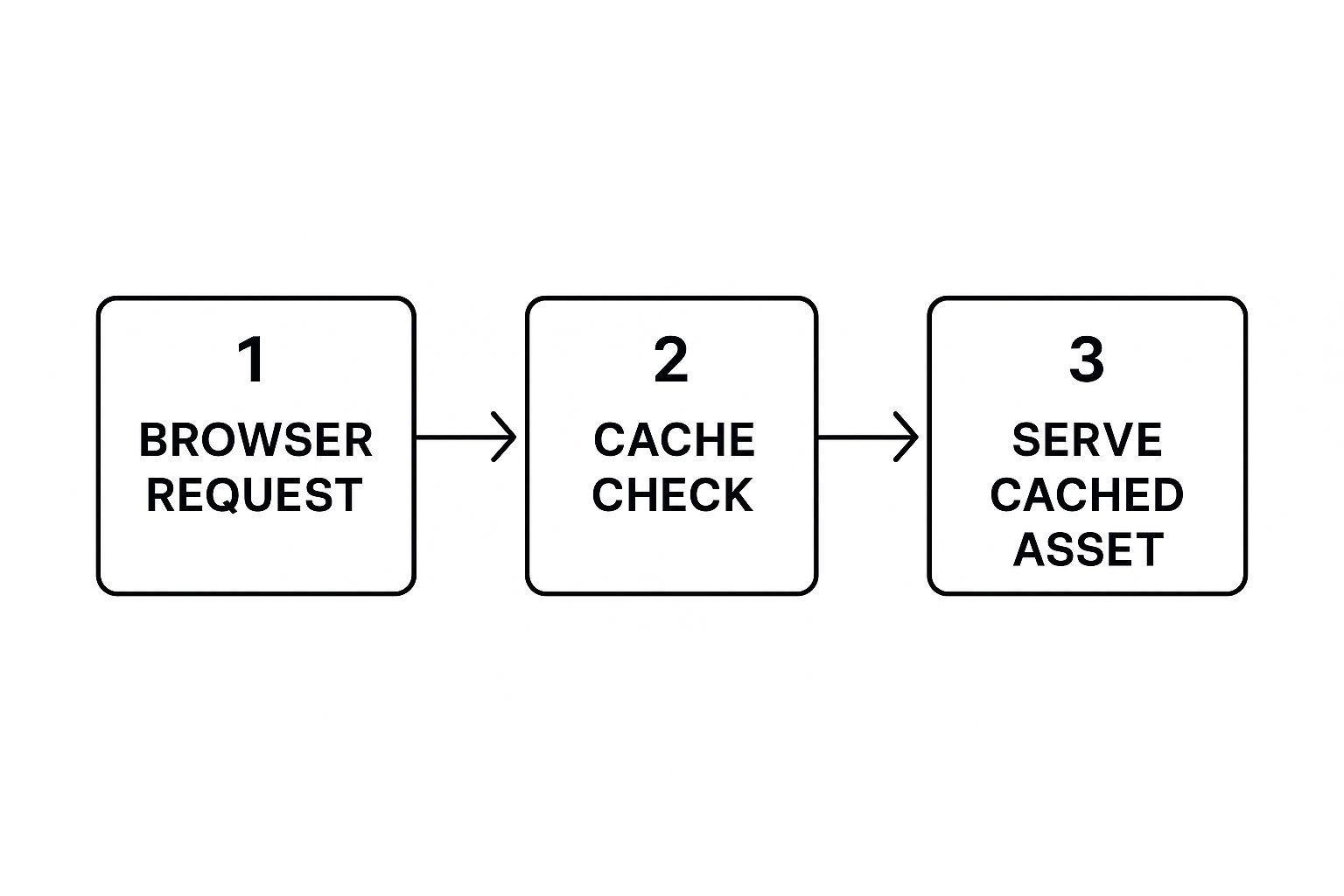
As you can see, that initial check of the local cache can prevent a ton of unnecessary back-and-forth with the server. It’s a direct line to better load times.
Nail Down Your Caching Policies
Just "turning on" caching isn't enough; you have to set the right rules. You do this with HTTP headers, and the most important one is Cache-Control. This little instruction tells browsers how long they should hold onto a specific file before checking for a new version.
- For static assets that rarely change (think images, CSS, and JavaScript), you can go long. Setting a header like
Cache-Control: public, max-age=31536000tells the browser to cache that file for an entire year. - For dynamic content that gets updated, like the HTML of a blog post, you'll want a much shorter cache time—or none at all—to make sure visitors always see the latest version.
Thankfully, you don't have to be a server admin to manage this. Most modern hosts and CDNs give you a user-friendly panel to control these settings. And if you're on a platform like WordPress, many of the best tools for WordPress optimization offer incredibly detailed control over caching rules right inside your dashboard.
The real goal here is to cache as much as you can for as long as possible without ever serving outdated content. A smartly configured caching policy is one of the most powerful levers you can pull to improve your Largest Contentful Paint (LCP) for anyone who's visited your site before.
Minify Your Code to Trim the Fat
Beyond caching, the next logical step is to shrink your code files. Every HTML, CSS, and JavaScript file on your site is filled with characters that are only there for us humans—things like comments, white space, and line breaks. A browser doesn't need any of that to run the code.
This is where minification comes in. It's an automated process that strips out all that unnecessary stuff. It takes a neat, readable file and squishes it into a single, compact line of code. The function is identical, but the file size is drastically smaller.
Here’s what that looks like with a tiny snippet of CSS:
Before Minification (Human-Friendly):
/* Main Button Styles */
.button-primary {
background-color: #007bff;
color: #ffffff;
border-radius: 5px;
}
After Minification (Browser-Friendly):
.button-primary{background-color:#007bff;color:#fff;border-radius:5px}
That might not look like much, but when you apply this across thousands of lines of code, minification can easily cut file sizes by 30-50%, sometimes even more. Smaller files mean faster downloads and less work for the browser.
Bundle Your Files to Cut Down on Chatter
Another game-changing technique is concatenation, or what most people just call bundling. It wasn't long ago that websites would load dozens of separate CSS and JavaScript files. The problem? Every single one of those files requires its own HTTP request, and each request adds a little bit of network delay.
Modern development tools fix this by bundling multiple files into one. So instead of loading ten different JavaScript files, your build process combines them all into a single main.js file. Now the browser only has to make one trip to the server instead of ten.
This drastically reduces the back-and-forth between the browser and server. When you combine this with minification, you get a powerful double-whammy: fewer requests and a smaller total payload. Most modern frameworks and build tools like Webpack or Vite do this for you right out of the box, ensuring your code is always delivered as efficiently as possible.
Optimizing Images and Media Without Losing Quality
Great visuals are a must for any engaging website, but let's be honest—they're often the biggest performance hogs. Heavy, unoptimized images and videos act like anchors, dragging down your load times and sending visitors bouncing. Getting a handle on media optimization is probably one of the most significant things you can do to nail your LCP score and make your entire site feel snappier.
The real trick is finding that perfect balance. You need to shrink your file sizes down as much as you can, but without turning your stunning visuals into a pixelated, blurry mess. Thankfully, with modern tools and formats, this is easier than ever.
Choose the Right Image Format
The very first decision you make—what format to save your image in—has a huge impact on file size. For years, we relied on JPEGs, PNGs, and GIFs. But the new kids on the block offer far better compression, which means smaller files with virtually no drop in quality.
- WebP: This format, developed by Google, has become the new standard for a reason. It handles both lossy and lossless compression, supports transparency, and even animation. An average WebP image is 25-34% smaller than the same JPEG, and you'd be hard-pressed to spot the difference. With near-universal browser support, it's a safe and effective choice.
- AVIF: This is the next frontier. AVIF offers even more aggressive compression than WebP, often coming in 30% smaller than a comparable WebP file. The quality-to-size ratio is incredible, but browser support is still playing catch-up. This means you absolutely need to provide a fallback (like WebP or JPEG) for older browsers that can't render it.
For most sites today, the winning strategy is to serve AVIF images with a WebP fallback. This gives users on modern browsers the smallest possible files while ensuring everyone else still gets a highly optimized image.
Implement Responsive Images
It’s a massive waste of bandwidth to send a huge, high-resolution desktop image to someone on a tiny smartphone screen. They won't see any of the extra detail, but their device still has to download every last byte. This is exactly the problem responsive images were designed to solve.
By using the <picture> element or adding srcset and sizes attributes to your <img> tags, you give the browser a menu of image sizes to choose from. The browser then intelligently picks and downloads only the most appropriate version for that user's screen.
Think of it like a tailored suit versus a one-size-fits-all t-shirt. You're delivering an image that's perfectly fitted for every device, which dramatically improves mobile performance and saves your users' data.
This isn't just a minor tweak. For an image-heavy page, making your images responsive can literally cut the mobile page weight in half. If you're using a static site generator, some fantastic tools like Hugo can even automate the creation of these different image sizes for you during the build process.
Master Image Compression
After you've picked the right format and set up responsive sizes, the final touch is compression. This is where algorithms intelligently strip out unnecessary data from the image file to shrink it even further. You have two main options here:
- Lossless Compression: This method reduces file size without throwing away any image data. It's great for detailed graphics where every pixel counts, but the file size reduction is more modest.
- Lossy Compression: This is where the big wins are. Lossy compression permanently removes some data, but when done right, the quality difference is imperceptible to the human eye. For most photos on the web, a lossy compression setting around 70-85% quality hits the sweet spot between size and clarity.
You can find plenty of automated tools and CMS plugins to handle this, but for your most important visuals, I'd recommend manually running them through a tool like Squoosh or ImageOptim. This gives you fine-grained control to find that perfect balance.
Defer Off-Screen Media with Lazy Loading
Why force a visitor to download every single image on a long page—including the ones way down in the footer—just to see the content at the top? It makes no sense. That’s where lazy loading comes in.
Lazy loading is a beautifully simple technique that tells the browser not to load images or videos that are "below the fold" (i.e., not currently visible). As the user scrolls down, the media loads just in time for them to see it.
The impact on initial page load metrics like FCP and LCP is huge. By loading only what's immediately necessary, the browser can render the visible part of the page in a fraction of the time. Better yet, implementation is a breeze—just add the loading="lazy" attribute to your <img> and <iframe> tags. Modern browsers take care of the rest.
Choosing the Right CDN and Hosting Environment

Your website’s infrastructure is the invisible foundation of its performance. You can optimize every image and line of code, but none of it will fully make up for a slow server or high latency caused by physical distance. This is where a Content Delivery Network (CDN) and a top-notch hosting environment become your most powerful allies.
Think about it this way: if your server is in New York, a user from Sydney has to send a request halfway across the world and wait for the response to travel all the way back. Every millisecond of that journey adds up, creating a noticeable lag for your global audience.
A CDN smashes this distance barrier by building a distributed network of servers. It essentially places copies of your site's static assets—like images, CSS, and JavaScript—in strategic locations worldwide. When that user from Sydney visits, the CDN serves those files from a local server in Australia. The result? A massive reduction in travel time and a much faster experience.
Selecting Your CDN Provider
When you're shopping for a CDN, don't just look at the basic promise of speed. The best providers offer a suite of features that can seriously upgrade your site's performance and security.
Here's what I always check for:
- Global POPs: Look at the provider's network map. You need Points of Presence (POPs) where your audience actually lives. A CDN with a hundred POPs is useless to you if none are in your target regions.
- HTTP/3 Support: Make sure the CDN uses modern protocols like HTTP/3. It’s built for the modern web, offering quicker connections and more reliable performance, especially on spotty mobile networks.
- Image Optimization: Many top-tier CDNs now include real-time image optimization. This feature can automatically compress your images and convert them to next-gen formats like WebP or AVIF on the fly, saving you a ton of manual work.
- Security Features: A good CDN is also your first line of defense. Look for built-in DDoS mitigation and a Web Application Firewall (WAF) to shield your site from common attacks.
Getting a CDN up and running is usually straightforward—often just a simple DNS change to route traffic through their network. The performance boost is almost instant, especially for sites with a geographically diverse user base.
A well-configured CDN is one of the most effective ways to lower your Time to First Byte (TTFB). By serving content from an edge server close to the user, you drastically cut down the initial connection latency that often inflates this critical metric.
How Hosting Choices Impact Speed
Your hosting environment is the other half of the infrastructure puzzle. A slow or overloaded server will bottleneck performance, no matter how great your CDN is. The type of hosting you pick has a direct and immediate impact on how quickly your site can handle traffic and respond to requests.
Shared hosting might be cheap, but you often pay the price in performance. Your site is crammed onto a server with hundreds of others, and a traffic spike on a neighboring site can bring yours to a crawl. For any serious business website, a more robust solution is non-negotiable.
When assessing your infrastructure needs, choosing the right cloud provider is paramount. Solutions like managed WordPress hosting, Virtual Private Servers (VPS), or dedicated cloud instances give you guaranteed resources and far more control. These setups are engineered for speed and reliability. For an even bigger leap, pairing great hosting with a modern architecture is key; our guide to different static site CMS options can point you in the right direction.
The data speaks for itself. In the US, the average Time to First Byte (TTFB) is around 800 milliseconds for mobile and 600 milliseconds for desktop. First Contentful Paint (FCP) isn't much better, at 1.4 seconds on mobile and 1.2 seconds on desktop. A powerful hosting setup is your best weapon for crushing these averages and delivering a great user experience from the very first byte.
Building a Culture of Continuous Performance Monitoring
Getting your site fast is one thing. Keeping it fast is a whole different ball game.
Think of it this way: launching a high-performance website isn't the finish line. It’s the starting point. Every new feature, content update, or third-party script you add threatens to undo all your hard work. This is why you need to move from reactive, panicked fixes to a proactive culture built around performance.
At the heart of this culture is something called a performance budget. It's essentially a strict "calorie count" for your web pages, setting firm limits that can't be ignored. These are the non-negotiable thresholds all new development must respect. For instance, you might set a goal to keep page load times under 3 seconds or ensure the Largest Contentful Paint stays under 2.5 seconds. You can dive deeper into effective website performance metrics at Nitropack.io.
To get the full picture, you need to combine lab data (from tools like PageSpeed Insights) with Real User Monitoring (RUM) data. This dual-pronged approach shows you how your site performs in a controlled test and how it behaves for actual people out in the wild.
Weaving Automated Checks into Your Workflow
A performance budget is only as good as its enforcement. The best way to make it stick is to automate performance checks directly into your development pipeline. This is how you catch regressions before they ever make it to a live server and frustrate your users.
A performance budget transforms speed from a vague goal into a concrete design constraint. It forces conversations and trade-offs early in the development process, preventing performance debt from accumulating.
You can set up simple tools to run automated tests on every single code commit. If a change pushes a metric over its limit, the build gets flagged—or even fails entirely. This gives developers instant, unavoidable feedback, making it crystal clear that performance is everyone's job.
Here’s how to put that into practice:
- Set Up Alerts: Your monitoring tools should automatically ping your team via email or Slack the moment a key metric like LCP or INP takes a nosedive.
- Track What Matters: Don't try to watch everything. Focus your energy on the most critical user journeys: your homepage, key product pages, and the checkout flow.
- Document Everything: Maintain a clear, accessible record of your performance goals and test results. Our guide on using Notion for project management offers a solid framework for organizing this kind of ongoing work.
This continuous feedback loop is what keeps your site fast as it grows and changes. It’s how you protect the user experience you’ve worked so hard to build.
Common Questions on Web Performance
Even with a solid plan, you're bound to run into questions as you start optimizing your website. Let's tackle some of the most common ones I hear from people diving into site speed.
How Often Should I Actually Check My Site's Performance?
There's no single magic number, but a good rhythm is to perform a deep-dive analysis quarterly. You should also run tests immediately after any significant site change—think theme updates, installing a new plugin, or adding a major script.
For high-stakes sites where performance directly impacts revenue, I strongly recommend setting up automated monitoring. Tools that ping your key pages daily or weekly can alert you to a problem long before it starts costing you customers or hurting your search rankings.
Are Third-Party Scripts Really That Bad for Speed?
Yes, they absolutely can be. I've seen countless sites get bogged down by scripts for analytics, ads, live chat widgets, and social media feeds. Each one is another external HTTP request the browser has to make, and each one can hold up the rendering of your page.
Before adding any new script, ask yourself: is this feature truly essential? If it is, make sure you load it intelligently. Using async or defer attributes is non-negotiable. This simple tweak allows the browser to keep building your page while the script loads in the background, which is a massive win for perceived performance.
The combined weight of a few "small" third-party scripts often becomes the single biggest performance killer on a website. Audit them relentlessly and measure their impact.
If I Can Only Do One Thing, What’s the Best Way to Improve Site Speed?
If I had to pick just one thing that delivers the most bang for your buck, it's almost always image optimization. Time and time again, the number one culprit behind slow pages and abysmal LCP scores is large, uncompressed images.
Properly sizing your images for their containers, running them through a good compression tool, and serving them in modern formats like WebP can slash your page weight dramatically. It's often the easiest fix with the most significant impact, making it the perfect starting point for anyone serious about speed.